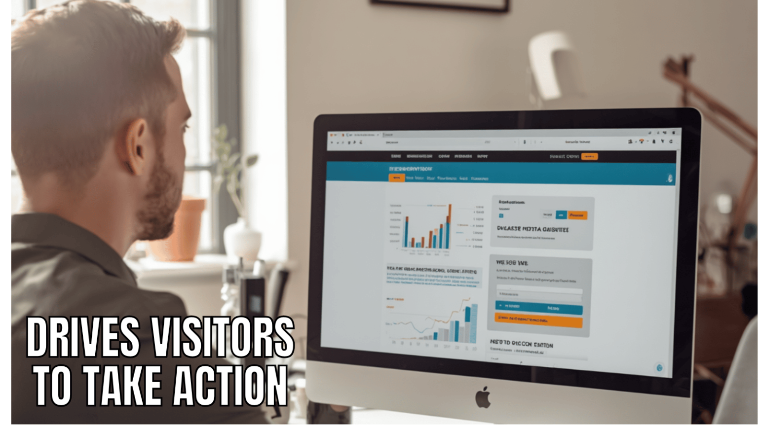
If your landing pages are not converting, you are not just losing leads. You are setting money on fire every time someone clicks your ad, reads your email, or follows your link — and bounces without taking action.
This guide gives you a complete, data-backed, 2026-ready framework for building landing pages that actually convert. We cover everything from page speed and AI personalization to traffic source optimization and Answer Engine Optimization (AEO) — topics most guides from 2021 still have not touched.
By the end, you will have a step-by-step system to build, test, and improve any landing page, whether it is for a PPC campaign, lead generation, SaaS product, or eCommerce store.

1. What Makes a Landing Page ‘High-Converting’ in 2026?
A landing page is not a homepage. It is a focused, single-purpose destination built around one specific action — whether that is signing up, buying, booking, or downloading.
Key insight: Pages with a single, focused offer see a 1.6% higher conversion rate than pages juggling multiple offers. Every additional option you add is a micro-distraction that chips away at your conversion rate.
In 2026, the definition of a high-converting landing page has evolved. Static, one-size-fits-all pages are being replaced by dynamic, personalized experiences. AI now drives performance on the best pages by adapting headlines, CTAs, and visuals in real time based on who is visiting and where they came from.
Here are the core pillars of a high-converting landing page in 2026:
- Single, unambiguous conversion goal
- First-screen clarity — the visitor instantly understands the offer
- Trust signals placed where they matter most — near CTAs and claims
- Mobile-first design and interaction quality
- Sub-2-second page load speed
- Personalization based on traffic source and user behavior
- Continuous A/B testing with clean attribution
2. Page Speed — The Silent Conversion Killer
Before a single visitor reads your headline, your page speed has already won or lost the conversion. This is the most underestimated element on this list.
Pages loading in 1 second convert 3x higher than pages loading in 5 seconds. 30% of users abandon a page that takes longer than 6 seconds to load.
No amount of headline testing, testimonial quality, or CTA optimization can compensate for a fundamentally slow page. Speed is the foundation everything else is built on.
Core Web Vitals Targets for 2026
Google’s Core Web Vitals are now a direct ranking and user experience signal. Hit these benchmarks:
- Largest Contentful Paint (LCP): Under 2.5 seconds
- Cumulative Layout Shift (CLS): Under 0.1
- Interaction to Next Paint (INP): Under 200 milliseconds
Actionable Speed Fixes
- Convert all images to WebP format — WebP files are 25-35% smaller than equivalent JPEG or PNG files with zero visible quality difference. On a page with 5 images, this alone can cut your image payload by 500KB to 1MB.
- Set explicit width and height on all images — this prevents layout shift (CLS) as images load in, stabilizing your page immediately.
- Use lazy loading for images below the fold — only load what the user can currently see.
- Compress all images to under 100KB before upload.
- Remove every third-party script that does not directly contribute to conversion — each tracking pixel, chat widget, and analytics tag adds load time.
- Consider AMP (Accelerated Mobile Pages) for paid search landing pages where speed is most critical.
Pro Tip: Use Google PageSpeed Insights and GTmetrix to audit your page. Fix the highest-impact issues first — usually uncompressed images and render-blocking scripts.
3. Mobile-First Design — Beyond Just Being Responsive
83% of all landing page traffic now comes from mobile devices. Dynamic landing pages convert 25.2% more mobile users than static ones.
Most teams treat mobile optimization as an afterthought — a final QA checkbox before launch. In 2026, mobile interaction quality needs to be a release gate, not a post-launch fix. If your page does not work perfectly on a 375px screen, it does not work.
Mobile Design Principles That Drive Conversions
- Thumb-friendly CTA placement — keep primary buttons in the lower half of the screen where thumbs naturally land
- Touch targets at minimum 44×44 pixels — small buttons are conversion killers on touch screens
- Single-column layout — multi-column layouts break down on small screens
- Fonts at minimum 16px — anything smaller forces users to pinch-zoom
- Sticky CTA bars — a persistent call-to-action visible as the user scrolls can significantly increase mobile conversion rates
- Minimal form fields — on mobile, every extra field increases friction. Ask only for what you absolutely need
- Click-to-call buttons — for service businesses, a direct dial CTA converts exceptionally well on mobile
Tools to Test Mobile Performance
- Google Mobile-Friendly Test
- PageSpeed Insights (mobile tab)
- BrowserStack for real device testing
- Hotjar for mobile heatmaps and session recordings
4. Headlines, Copy, and Psychological Triggers
Your headline is the most important piece of copy on your landing page. Research consistently shows that around 80% of visitors never make it past the headline. It is a gate — and whether visitors walk through it determines everything.
What Makes a Headline Convert in 2026
- Clarity over cleverness — the visitor should understand your offer in under 3 seconds
- Benefit-led, not feature-led — tell them what they get, not what you have
- Specificity — ‘Grow Your Email List by 47% in 30 Days’ beats ‘Grow Your Email List’
- Power words — words like ‘proven,’ ‘guaranteed,’ ‘free,’ ‘instant,’ and ‘new’ trigger emotional responses
- Match the ad or email that sent the visitor — message continuity is critical for PPC landing pages
Psychological Triggers to Embed in Your Copy
Successful landing pages in 2026 tap into six core psychological drivers:
- Fear of Missing Out (FOMO) — limited time offers, countdown timers, and scarcity messaging (‘Only 3 spots left’) drive urgency
- Social proof validation — humans look to others’ behavior to guide their own decisions
- Authority and credibility — logos, certifications, press mentions, and credentials build immediate trust
- Reciprocity — offering genuine value upfront (a free guide, a free audit, a free trial) makes visitors psychologically inclined to give something back
- Cognitive ease — reduce mental effort. Use simple language, short sentences, and clear visual hierarchy so the brain can process your offer effortlessly
- Immediate gratification — tell visitors exactly what happens the moment they click
Cognitive Load Theory in Practice
Every element on your landing page that is not helping conversion is hurting it. Cognitive load theory tells us that the brain has limited processing capacity. The more decisions, distractions, and visual noise you add, the higher the mental burden — and the lower your conversion rate.
- Ruthlessly remove navigation menus from landing pages
- Use white space generously — breathing room makes content easier to process
- Limit color palette to 2-3 colors to reduce visual noise
- Keep paragraphs to 2-3 sentences maximum
5. CTAs That Actually Convert
Most CTAs fail for one of two reasons: they are too vague (‘Submit’, ‘Click Here’) or they are buried. A high-converting CTA is specific, benefit-focused, visually prominent, and placed at the right moment in the user journey.
CTA Copy That Works
- Start with a verb: ‘Get’, ‘Download’, ‘Start’, ‘Book’, ‘Claim’
- Add a benefit or outcome: ‘Get My Free SEO Audit‘, ‘Start Growing Today’, ‘Claim Your 30-Day Trial’
- Reduce perceived risk: ‘No credit card required’, ‘Cancel anytime’, ‘Free — No strings attached’
- First-person phrasing outperforms second-person — ‘Start My Free Trial’ typically converts better than ‘Start Your Free Trial’
CTA Placement Strategy
Do not just place a CTA at the bottom. High-converting pages use multiple CTAs placed strategically:
- Above the fold — the first CTA should be visible without scrolling
- After the problem/solution section — when the pain point resonates, catch them with a CTA
- After social proof — when trust peaks, conversion opportunity peaks
- At the bottom — for visitors who read everything
Button Design
- High contrast — your CTA button must stand out from everything else on the page
- Directional cues — arrows, images of people looking toward the CTA, and visual flow guides eyes toward the button
- Size matters — the primary CTA should be the largest interactive element on the page
- White space around the button increases click-through rates — give it room to breathe
6. Social Proof — Placement Is Everything
Social proof works. But where you place it matters as much as having it. Many pages dump all testimonials in a section at the bottom, where they are rarely seen. This is a missed opportunity.
Evidence should appear near the claim it validates and near the action it supports — not just at the bottom of the page as an afterthought.
Types of Social Proof to Use
- Customer testimonials with full name, photo, job title, and specific result achieved
- Case studies with quantifiable outcomes (‘Increased conversions by 63% in 6 weeks’)
- Star ratings and review counts — especially from Google, G2, Trustpilot, or Clutch
- Client logos — instantly communicate authority when visitors recognize familiar brands
- Subscriber or customer count — ‘Trusted by 50,000+ marketers’ is a powerful credibility signal
- Press and media mentions — ‘As seen in Forbes, Inc, HubSpot’
- Influencer or expert endorsements — a recognized name vouching for your product short-circuits skepticism
Placement Rules
- Place a brief testimonial or review count directly below the headline — it reinforces the claim before the visitor has scrolled at all
- Place a case study or results-focused testimonial right before your primary CTA — trust peaks before the ask
- Address objections with specific proof — if your biggest objection is ‘it’s too complicated,’ place a testimonial about ease-of-use right at that section
7. Traffic Source Optimization — The Strategy Most Guides Ignore
This is the section that separates advanced conversion optimizers from everyone else. Your landing page should not look the same for every traffic source, because the visitors are fundamentally different.
A visitor from an email list already knows and trusts you. A visitor from a cold Facebook ad has never heard of you. Treating them the same way is leaving conversions on the table.
| Traffic Source | Visitor Intent | Trust Level | Recommended Strategy |
| Email list | High — they subscribed to hear from you | High | Longer form, higher-commitment CTA, detailed copy |
| Paid Search (Google) | High — actively searching for a solution | Medium | Match headline exactly to ad copy, fast load speed, clear offer |
| Paid Social (Facebook/Instagram) | Low-Medium — interrupted browsing | Low | Heavy social proof upfront, low-friction CTA, strong visual hook |
| Organic Search | Medium-High — researching a topic | Medium | Educational angle, value-first, build trust before the ask |
| Referral / Guest Post | Medium — came via a recommendation | Medium-High | Reference the source, lean into authority and credibility |
| Retargeting | High — already visited before | High | Address the specific objection that stopped them last time |
Pro Tip: Use UTM parameters to segment your analytics by traffic source. Run separate A/B tests for each source — what works for email will not necessarily work for cold social ads.
8. AI and Personalization in 2026
The biggest shift in landing page optimization over the last two years is the rise of AI-powered personalization. The best-performing pages in 2026 are not static — they adapt in real time based on who is visiting and how they got there.
What AI-Powered Landing Pages Do
- Swap headlines dynamically based on the visitor’s search query, ad clicked, or referral source
- Show different testimonials based on the visitor’s industry or company size (when known)
- Adjust CTA copy and offers based on whether the visitor is a first-time or returning visitor
- Use behavioral analytics (scroll depth, hover patterns, time on page) to trigger exit-intent offers at the optimal moment
- Personalize images and visuals — a SaaS page might show a dashboard screenshot relevant to the visitor’s role
Tools to Implement AI Personalization
- Unbounce Smart Traffic — automatically routes visitors to the variant most likely to convert them
- Dynamic Text Replacement (DTR) — matches headline text to the exact keywords in the visitor’s search
- Mutiny — B2B account-based personalization for high-value landing pages
- Google Optimize successor tools — for rule-based and ML-driven personalization
Progressive Disclosure
Rather than showing all information at once, progressive disclosure reveals content as the user scrolls, using scroll-triggered animations and staged reveals. This approach maintains engagement, prevents information overload, and guides visitors through a logical persuasion sequence before presenting the CTA.
9. Answer Engine Optimization (AEO) — The 2026 Imperative
Google is no longer the only search engine that matters. In 2026, a significant and growing percentage of searches happen through AI-powered tools — ChatGPT, Perplexity, Google’s AI Overviews, and Gemini. These tools pull answers differently than traditional search engines, and your landing page content needs to be structured accordingly.
What AEO Means for Landing Pages
- Write FAQ sections with direct, complete answers — AI tools love content that directly answers a question in 1-3 sentences
- Use structured data (FAQ schema, HowTo schema) so search engines can parse your content as answers
- Use conversational language that mirrors how people speak queries out loud or type them into AI tools
- Answer the exact question in the first sentence of your response — do not bury the answer in paragraphs of context
- Cover ‘People Also Ask’ questions from Google as H3 subheadings — these signal to AI tools that your content addresses related intent
Voice Search Alignment
Over 1 billion voice searches occur monthly. Voice queries are conversational, longer, and question-based (‘What is the best landing page builder for small businesses?’ rather than ‘landing page builder’). Optimize for these by:
- Including natural question phrases as subheadings (What, How, Why, When, Which)
- Keeping answers concise and direct — voice results typically pull short, definitive answers
- Ensuring your NAP (Name, Address, Phone) is accurate and schema-marked for local voice queries
10. Long-Tail Keywords and SEO for Landing Pages
Broad keyword strategies are effectively dead for landing pages. In 2026, the combination of Google’s intent-matching algorithms and the rise of AI-powered search has made long-tail keyword targeting more important than ever.
Why Long-Tail Keywords Win for Landing Pages
- Higher purchase intent — ‘best CRM for real estate agents under $50/month’ shows far more buying intent than ‘CRM software’
- Lower competition — long-tail keywords are easier to rank for and cheaper to bid on in PPC
- Better conversion rates — visitors arriving via specific queries are further down the decision funnel
- Voice and AI search compatibility — longer, conversational phrases match how people search via AI tools and voice
How to Find the Right Long-Tail Keywords
- AnswerThePublic — shows every question being asked around your core topic
- Google Search Console — reveals what queries already send traffic to your pages
- Ahrefs and SEMrush — filter for keywords with high intent modifiers: ‘best’, ‘how to’, ‘for [niche]’, ‘reviews’, ‘vs’
- Google’s ‘People Also Ask’ and ‘Related Searches’ — free intent data from the source
Location-Specific Landing Pages
If your business serves multiple locations, create dedicated landing pages for each one. Location-specific pages are digital signposts that serve both users and search engines — they make it easier to find your nearest location and rank significantly better for local queries.
- Include location-specific keywords in H1, meta title, and URL slug
- Add schema markup for NAP (Name, Address, Phone) on each location page
- Use location-specific testimonials and case studies where possible
- Ensure NAP consistency across all location pages and Google Business Profiles — inconsistency confuses Google’s search index
11. A/B Testing and Continuous Iteration
The highest-converting landing pages in the world did not start that way. They were tested, iterated, and optimized over months and years. A/B testing is not optional — it is how you turn a good landing page into a great one.
What to Test First (Ranked by Impact)
- Headline — the single highest-impact element on the page
- CTA copy and button color
- Hero image or video vs. no video
- Lead form length — fewer fields vs. more fields
- Social proof placement — above the fold vs. after the offer section
- Page layout — single column vs. two-column above the fold
- Pricing display — showing price vs. hiding it behind a CTA
Testing Rules That Improve Attribution Quality
- Test one major change per release cycle — multiple simultaneous changes make it impossible to know what drove the result
- Run tests until you reach statistical significance — premature decisions based on small samples lead to false optimization wins
- Define guardrail metrics before testing — e.g., ensure CTA changes do not increase conversions at the cost of lead quality
- Document every test with: objective, audience context, change scope, metrics tracked, result, and next action
- Shared documentation is one of the strongest predictors of sustained optimization performance — do not lose your learnings
Pro Tool Stack: Hotjar for heatmaps and session recordings. VWO or Optimizely for A/B testing. Google Analytics 4 for conversion tracking. Google PageSpeed Insights for speed audits.
12. Visual Design and the Above-the-Fold Experience
Your above-the-fold area — everything visible without scrolling — is the most valuable real estate on your page. This section must do three things instantly: communicate what you offer, who it is for, and why they should care.
F-Pattern and Z-Pattern Optimization
Eye-tracking research shows visitors scan pages in an F-pattern or Z-pattern before committing to reading in full. Design your layout to place key information (headline, key benefit, CTA) along these natural eye-movement paths.
Visual Hierarchy Rules
- The headline should be the largest text element on the page
- The CTA button should be the highest-contrast element — it should visually ‘pop’ before anything else
- Supporting copy should be smaller and lighter — visually subordinate to the headline and CTA
- Use imagery strategically — showing a happy customer using your product, or a clear product screenshot, consistently outperforms abstract visuals
Background Images and Hero Visuals
- For a personal brand: show your face — it builds human connection and trust
- For a product: show the product being used by a real person, or show the interface clearly
- For a service: show satisfied customers or the tangible outcome of your service
- Avoid generic stock photos of people shaking hands or staring at laptops — these actively reduce trust
- Video backgrounds can increase engagement but must not slow load time — compress aggressively or use a static fallback
Quick Reference: On-Page SEO Checklist for Landing Pages
| Element | Best Practice |
| Title Tag | Include year, primary keyword, and a power word. Under 60 characters. |
| Meta Description | Under 155 chars. Include a specific stat or benefit. Add a soft CTA. |
| URL Slug | Short and keyword-rich (e.g., /high-converting-landing-pages/) |
| H1 Heading | One per page. Clear, benefit-led, includes primary keyword. |
| H2/H3 Subheadings | Question-based where possible. Naturally include secondary keywords. |
| Image Alt Text | Descriptive and keyword-relevant — not stuffed, but informative. |
| Internal Links | Link to related service pages, blog posts, and pillar content. |
| Schema Markup | FAQ schema, HowTo schema, and Organization/LocalBusiness schema. |
| Word Count | 4,000+ words for pillar guides. 1,500+ for focused landing pages. |
| Author Bio | Add byline with credentials and expertise — critical for E-E-A-T. |
| Page Speed | LCP under 2.5s. WebP images. No unnecessary third-party scripts. |
| Mobile | Test on real devices. CTA above fold on mobile. 16px minimum font. |
Conclusion: Build a System, Not Just a Page
A high-converting landing page in 2026 is not a one-time project. It is a system — one that combines strong copy, technical performance, psychological triggers, traffic-source awareness, and continuous testing.
The businesses outperforming their competitors are not the ones with the prettiest pages. They are the ones who treat landing pages as conversion engines, measure everything, and iterate relentlessly.
Start with the fundamentals: fix your page speed, nail your headline, make your CTA unmistakable, and add proof near every claim. Then layer in AI personalization, AEO optimization, and traffic-source specific variants as you scale.
Most importantly, never stop testing. The page that converts best today will not be your best page in six months — if you keep improving it.
Frequently Asked Questions
What is a good conversion rate for a landing page in 2026?
Conversion rates vary widely by industry and traffic source. The average landing page converts at around 2.35%, while the top 10% of pages achieve 11.45% or higher. For lead generation pages, 10-15% is achievable with strong optimization. For cold traffic from paid social, 2-5% is a realistic target.
How many elements should a high-converting landing page have?
Every element must earn its place. At minimum, a landing page needs: a compelling headline, a subheadline, a clear value proposition, social proof, a strong CTA, and a hero image. Remove anything that does not actively move the visitor toward conversion.
How long should a landing page be?
Length should match the complexity of the offer and the temperature of the traffic. Cold traffic from paid social typically needs longer pages that build more trust. Warm email traffic can convert on shorter, more direct pages. Test both and let the data decide.
Should I use video on my landing page?
Video can increase conversions significantly — particularly for complex products or high-ticket offers. However, it must not come at the cost of page speed. Compress video aggressively, use a static image fallback, and always include captions since many mobile users watch without sound.
How do I optimize a landing page for AI search in 2026?
Structure your content with direct Q&A sections, use FAQ schema markup, write conversational long-tail content, and ensure your page fully answers the user’s question without requiring a click to another page. AI tools like ChatGPT and Perplexity favor content that is self-contained, authoritative, and clearly structured.